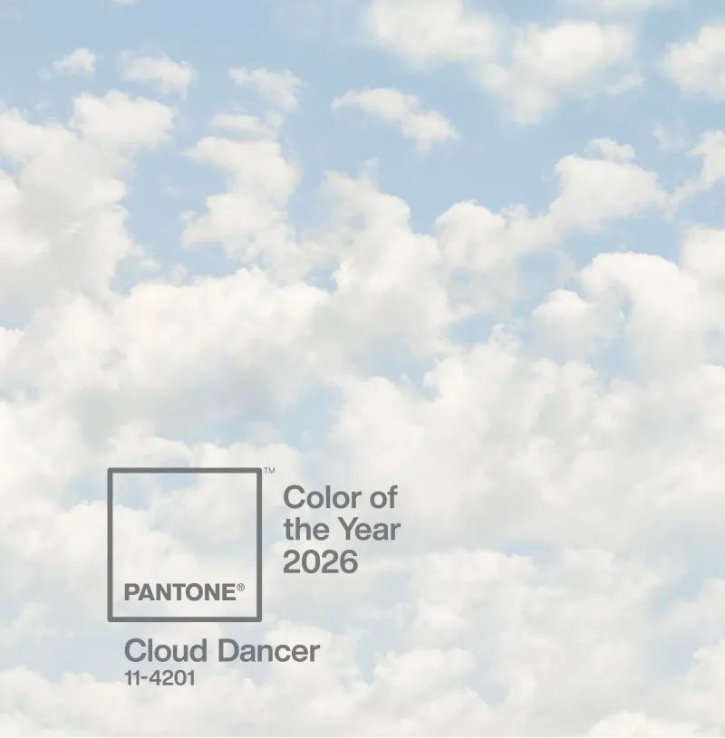
For the first time in the 27-year history of its Color of the Year program, Pantone has chosen white. PANTONE 11-4201 Cloud Dancer — a billowy, ethereal shade that sits somewhere between warm and cool — is the company's selection for 2026. And it's already dividing opinion.
The choice is deliberate. Pantone describes Cloud Dancer as a hue with an "aerated presence" that "acts as a whisper of calm and peace in a noisy world." In a cultural moment defined by visual overstimulation, algorithmic chaos, and endless scrolling, the decision to strip everything back to a shade of white feels less like playing it safe and more like making a statement through absence.

Pantone's framing is clear: Cloud Dancer is about reset. The company positions the colour as representing our collective desire for a fresh start, noting that by "peeling away layers of outmoded thinking, we open the door to new approaches." It's the visual equivalent of clearing your desk, closing your tabs, and starting from zero.
This isn't optical white — the sharp, clinical kind found in hospital corridors and tech product boxes. Cloud Dancer carries a subtle creaminess, closer to natural light filtered through clouds. That distinction matters. It makes the shade feel human rather than sterile, livable rather than aspirational.
What makes Pantone's Color of the Year significant for the marketing and branding world isn't the colour itself — it's the activation ecosystem that surrounds it. Cloud Dancer is already embedded across industries through a series of high-profile partnerships.
Motorola is launching a Cloud Dancer edition of the Edge 70, complete with quilted vegan leather and Swarovski crystal detailing. Joybird is rolling out the shade across more than 300 furniture silhouettes. Play-Doh is releasing a Cloud Dancer version of its modelling compound — positioning white not as the absence of colour, but as a blank canvas for creativity. Pura is translating the visual into fragrance. Mandarin Oriental is bringing it to life through spa treatments, afternoon teas, and immersive guest experiences.
The breadth of these collaborations illustrates how Color of the Year has evolved from a trend forecast into a cross-industry brand platform.
Cloud Dancer reflects a broader design movement already underway: emotional minimalism, quiet luxury, and clean visual experiences. Light colors are proven to reduce cognitive load, improve legibility, and support comprehension — qualities that matter in an era where attention is the scarcest resource.
For brands, the implications are practical. White space is no longer just a design principle — it's becoming a strategic positioning tool. Expect to see more restrained color palettes, breathing room in layouts, and brands that signal confidence by saying less rather than more.
Pantone has also released seven distinct colour palettes built around Cloud Dancer, ranging from Powdered Pastels to Glamour & Gleam, each designed for different applications across fashion, interiors, product design, and digital media. The versatility is the point: Cloud Dancer harmonises with virtually anything while allowing other elements to take centre stage.
Not everyone is convinced. Marketing experts at Texas A&M have noted that the choice favours safety over boldness, potentially limiting its cultural impact. After 2025's Mocha Mousse — a warm, inviting brown — the swing to white feels almost reactive. Some critics see it as Pantone retreating to neutrality at a moment when the world could use more vibrancy.
But perhaps that tension is exactly why it works. In a landscape where every brand is fighting to be the loudest, choosing silence is its own form of disruption.
Cloud Dancer is less a colour and more a mood: slow down, simplify, make space. Whether it becomes a lasting design movement or a one-year palate cleanser remains to be seen. But for brands willing to embrace restraint, 2026's colour of the year offers a compelling proposition — sometimes the most powerful thing you can put on a canvas is nothing at all.
Sources: