A new brand identity for the KUT Association
From a dated organisation to a vibrant, recognisable brand, with a branded-house system flexible enough for every KUT initiative.


01 · The brief
The brief
KUT’s existing branding lacked the vibrancy and sophistication needed to resonate with students and young professionals. The association needed an identity that balanced professionalism with approachability and stayed flexible for growth and digital use.
02 · What we did
What we did
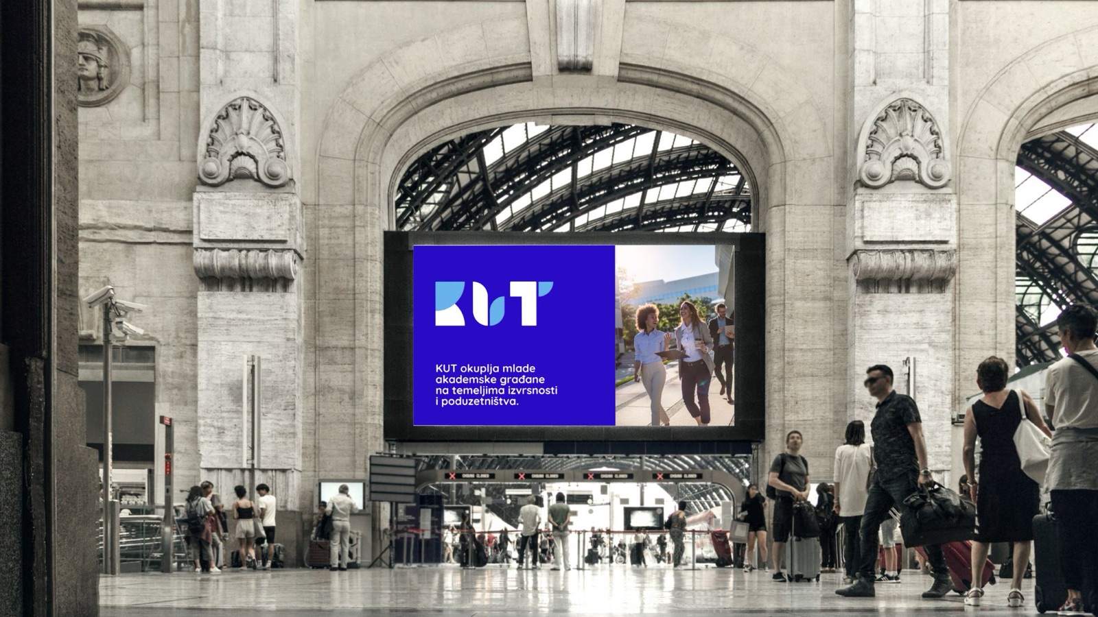
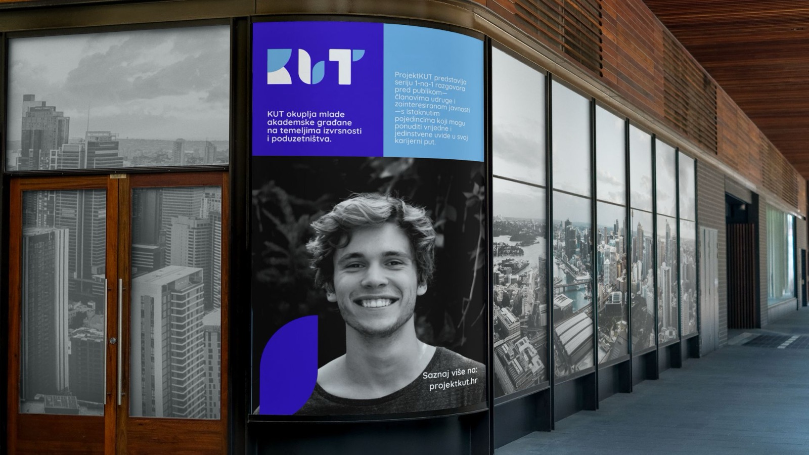
We built a versatile visual identity around a bold palette: Active Blue and Dreamy Blue as primaries, supported by energetic secondary hues, with gradients and geometric patterns that bring movement and depth.
A branded-house strategy organises KUT’s sub-brands under one visual framework: connected through consistent typography, colour and design elements, yet each with room for its own character. Quicksand and Montserrat form a type pairing that is clear, fluid and easy to apply.
03 · The outcome
The outcome
The new identity resonated strongly with its audience, lifting engagement and awareness, and gave KUT a robust foundation to support its growth and initiatives for years to come.

Next project